10 Usability Heuristics of Jacob Nielsen for E-commerce: How to Increase Conversion
Jakob Nielsen’s Heuristics are 10 usability principles that help create user-friendly, intuitive, and effective interfaces for e-commerce websites. Based on UX research, they serve as a foundation for improving the user experience (UX) in online shopping.
In this article, we’ll explore how to apply Nielsen’s principles to optimize e-commerce stores, increase conversion rates, and avoid common UX mistakes.
1. Visibility of System Status
This usability principle suggests that the system should clearly show the user what is happening through:
- Real-time feedback (loading indicators, button highlights)
- Operation statuses (e.g., order processing stages)
E-commerce use cases:
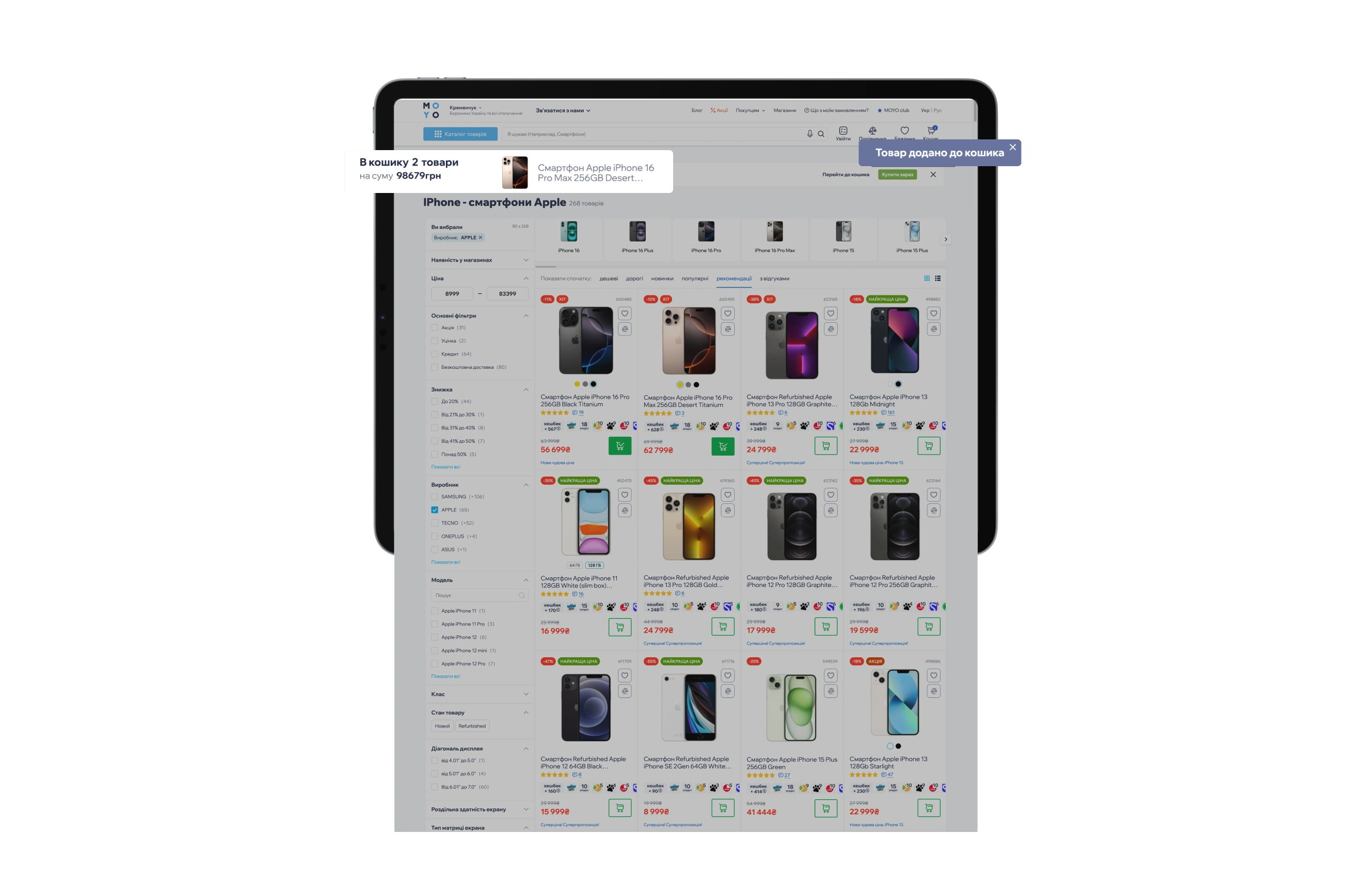
✅ Action confirmation
- How it works: A pop-up message (“Item added!”) appears after clicking “Buy.”
- Why it matters: It reduces the number of duplicate items added to the cart.
✅ Cart item counter
- How it works: The number next to the cart icon updates instantly.
- Why it matters: The user sees the result of their actions without additional steps.
✅ Product availability indicators
- How it works: Labels like “In stock” (green) or “Out of stock” (gray).
- Why it matters: Prevents attempts to purchase unavailable items.
Conclusion: System state visibility is one of the key principles of UX design for e-commerce. Its implementation reduces cart abandonment rates and increases customer loyalty.
2. Match Between System and the Real World
It means that the system should use language that users understand (avoiding technical jargon), familiar symbols, and logic based on everyday experience.
E-commerce use cases:
✅ Familiar icons and language
- How it works: A cart icon 🛒 and the label “cart” indicate a list of items selected for purchase, while 🔍 represents search.
- Why it matters: Users instantly recognize these elements without relying on memory.
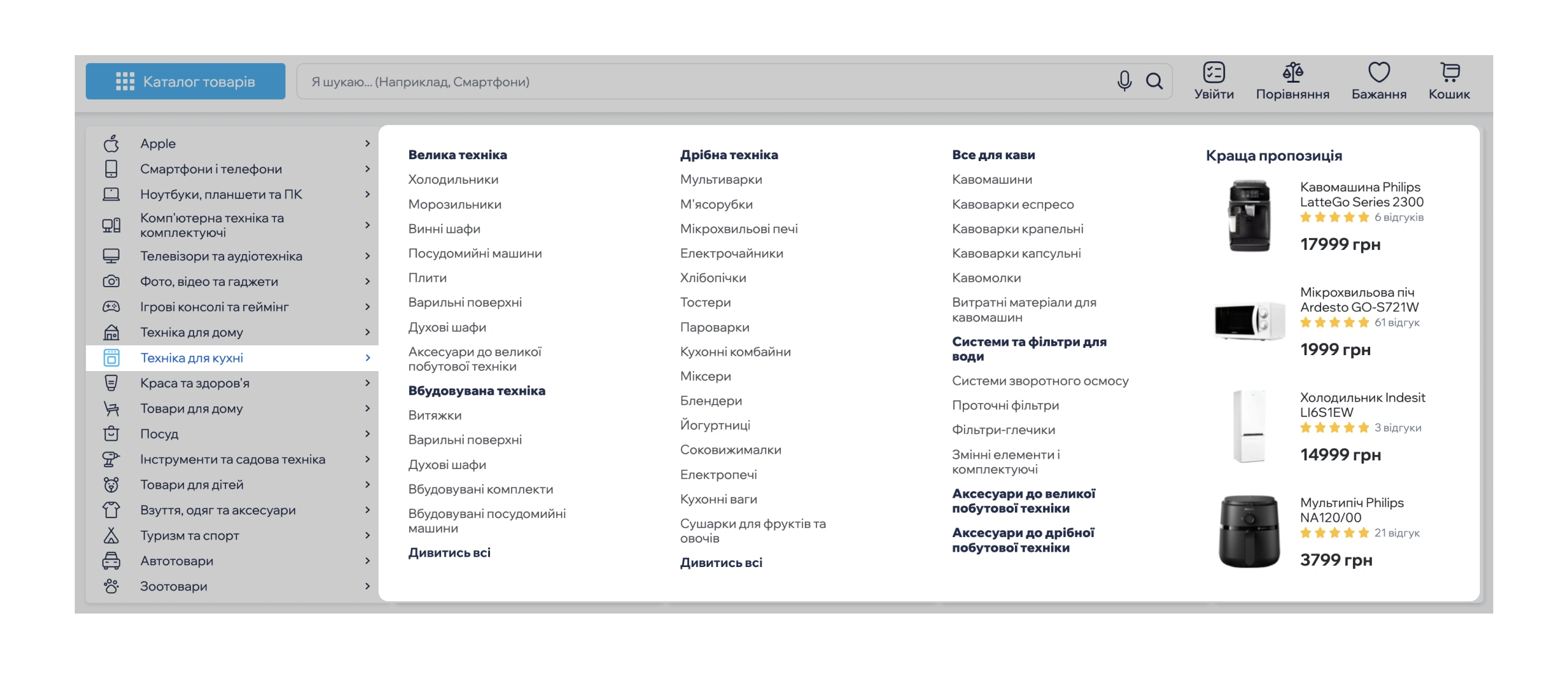
✅ Logical category structure
- How it works: Sections like “Men’s Clothing” or “Home Appliances” (similar to once at shopping malls).
- Why it matters: Reduces the number of clicks needed to find products.
Impact on conversion: People don’t want to learn new things—they expect online shopping to work just like in a physical store. Leveraging this principle boosts conversion because users: navigate the site more easily, feel in control (familiar logic = less stress), and are more likely to complete their purchases.
3. User Control and Freedom
The heuristic suggests that the interface should allow users to easily undo, edit, or revert previous actions without stress.
E-commerce use cases:
✅ Undo action in the cart
- How it works: The “Undo” option appears after removing an item from the cart (e.g., a pop-up message: “Item removed. Undo?”).
- Why it matters: Reduces accidental deletions and the need to search for items again.
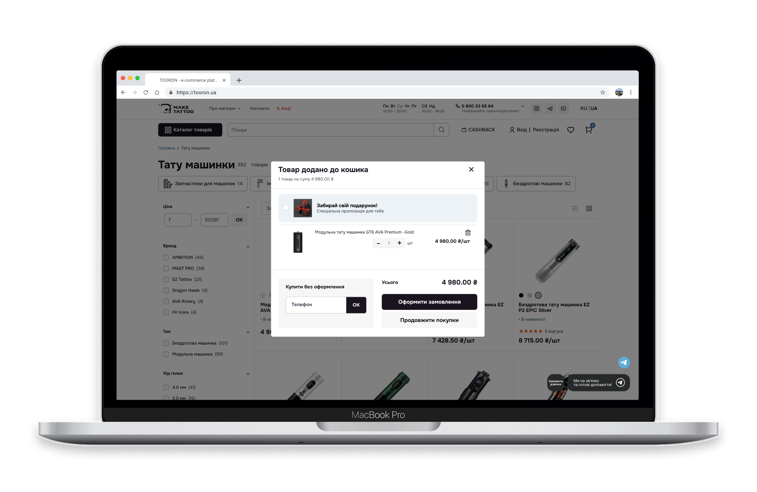
✅ Open cart after adding an item
- How it works: When a user clicks “Add to Cart,” the page doesn’t reload—instead, a pop-up appears with the options “Continue Shopping” and “Check Out.”
- Why it matters: Gives users the freedom to choose—keep shopping or proceed to payment.
Impact on conversion: E-commerce stores that let customers easily cancel, edit, and manage their orders see higher conversion rates and greater customer trust.
4. Consistency and Standards
The interface should be consistent (same buttons, fonts, colors for similar actions) and adhere to generally accepted UX/UI standards. This allows users to navigate without “guessing” the system’s logic, which is especially important for e-commerce, where every step impacts conversion.
E-commerce use cases:
✅ Consistent text and terminology
- How it works: Instead of using “Cart” on one page and “Basket” on another—stick to a single term.
- Why it matters: Avoids confusion, which is especially important for e-commerce UX.
✅ Consistent navigation
- How it works: The main menu is placed at the top, and the logo is clickable, leading back to the homepage.
- Why it matters: Users quickly find the sections they need, improving usability and reducing bounce rates.
Impact on conversion: Even small inconsistencies can deter users, whereas a consistent design makes shopping intuitive and pleasant.
5. Error Prevention
Every user mistake is a lost sale. It’s better to prevent than to fix.
E-commerce use cases:
✅ Clear communication of limitations
- How it works: Displaying the message “Minimum order amount for delivery: 100 USD” before checkout.
- Why it matters: Prevents user frustration by ensuring they’re aware of the conditions upfront—not at the last moment.
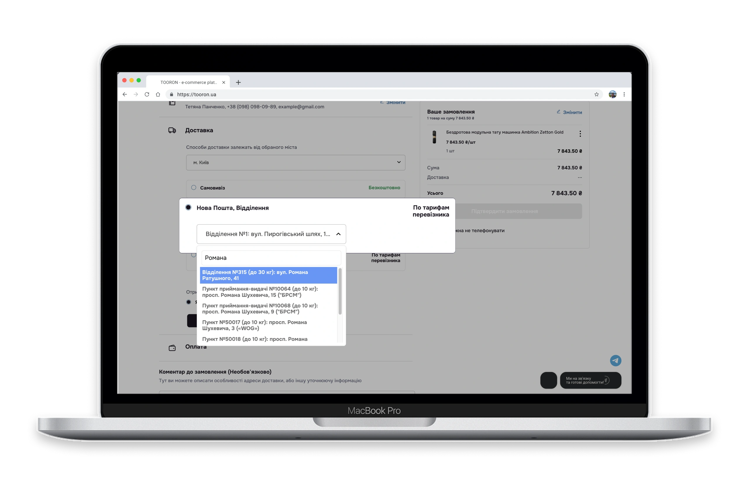
✅ Smart autofill
- How it works: Dropdown address suggestions as the user types + integration with postal carrier APIs.
- Why it matters: Reduces canceled orders due to incorrect data entry.
Impact on conversion: Reduces cart abandonment due to technical errors, boosts trust (users feel in control of the process), and saves resources (fewer support requests).
6. Recognition Rather Than Recall
The system should provide information explicitly, so users don’t have to memorize it.
E-commerce use cases:
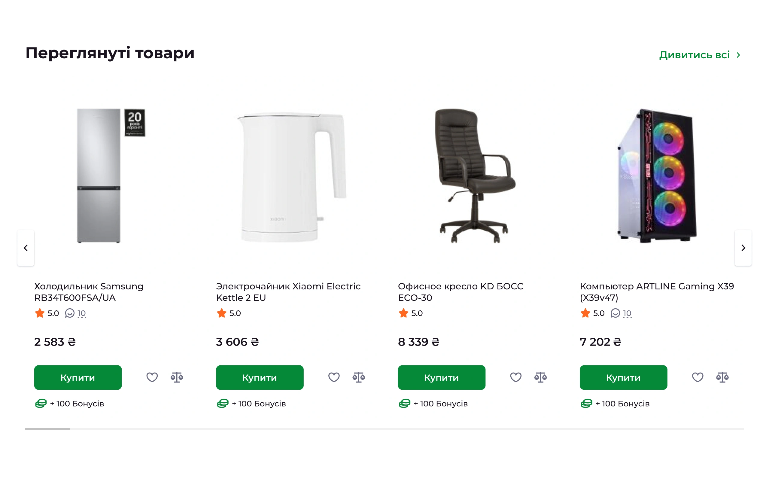
✅ Browsing history
- How it works: The “Recently Viewed” section on the homepage and product pages.
- Why it matters: Customers can quickly return to products without searching or memorizing names.
✅ Displaying entered data during checkout
- How it works: Showing order details (name, selected shipping address, payment method, etc.) before confirming the purchase.
- Why it matters: Customers can review their information without having to recall previously entered data.
Impact on conversion: Showing information upfront—rather than making users remember it—speeds up shopping and keeps customers satisfied.
7. Flexibility and Efficiency of Use
This principle ensures that the interface is intuitive for newcomers while still efficient for experienced users, providing multiple ways to complete tasks.
E-commerce use cases:
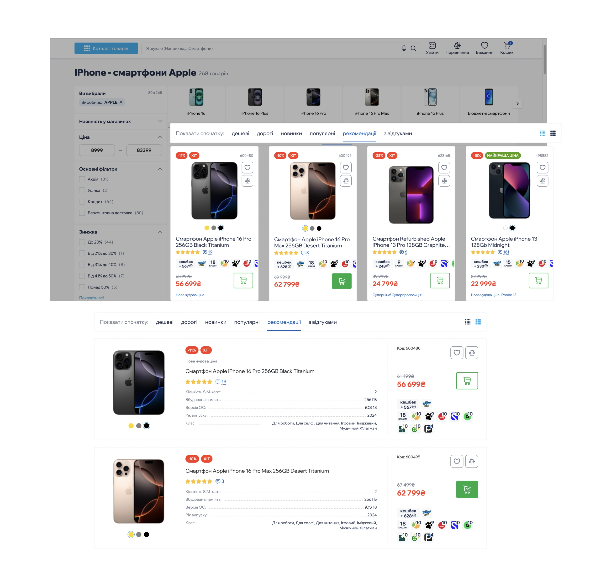
✅ Customizable interface
- How it works: Allows users to adjust product display (grid/list view) and choose the number of items per page (24/48/96).
- Why it matters: Each user can tailor the interface to their preferences, making it more convenient for their needs.
✅ Repeat/scheduled orders function
- How it works: Features like “Reorder,” “Subscription Orders,” and saved shopping templates.
- Why it matters: Saves time for loyal customers by simplifying repeat purchases.
Impact on conversion: Boosts loyalty (experienced customers get tools for faster purchases), reduces drop-offs (newcomers find it easier to navigate), and increases conversion (multiple paths lead to checkout).
8. Aesthetic and Minimalist Design
The interface should only include essential information, avoiding clutter. Every element must serve a specific purpose. The design should look modern and aesthetically pleasing.
E-commerce use cases:
✅ Progressive disclosure
- How it works: Delivery options, payment methods, warranty details, etc., are hidden in an accordion or behind a “Learn More” button.
- Why it matters: Basic information is visible upfront, while details appear only when the user needs them.
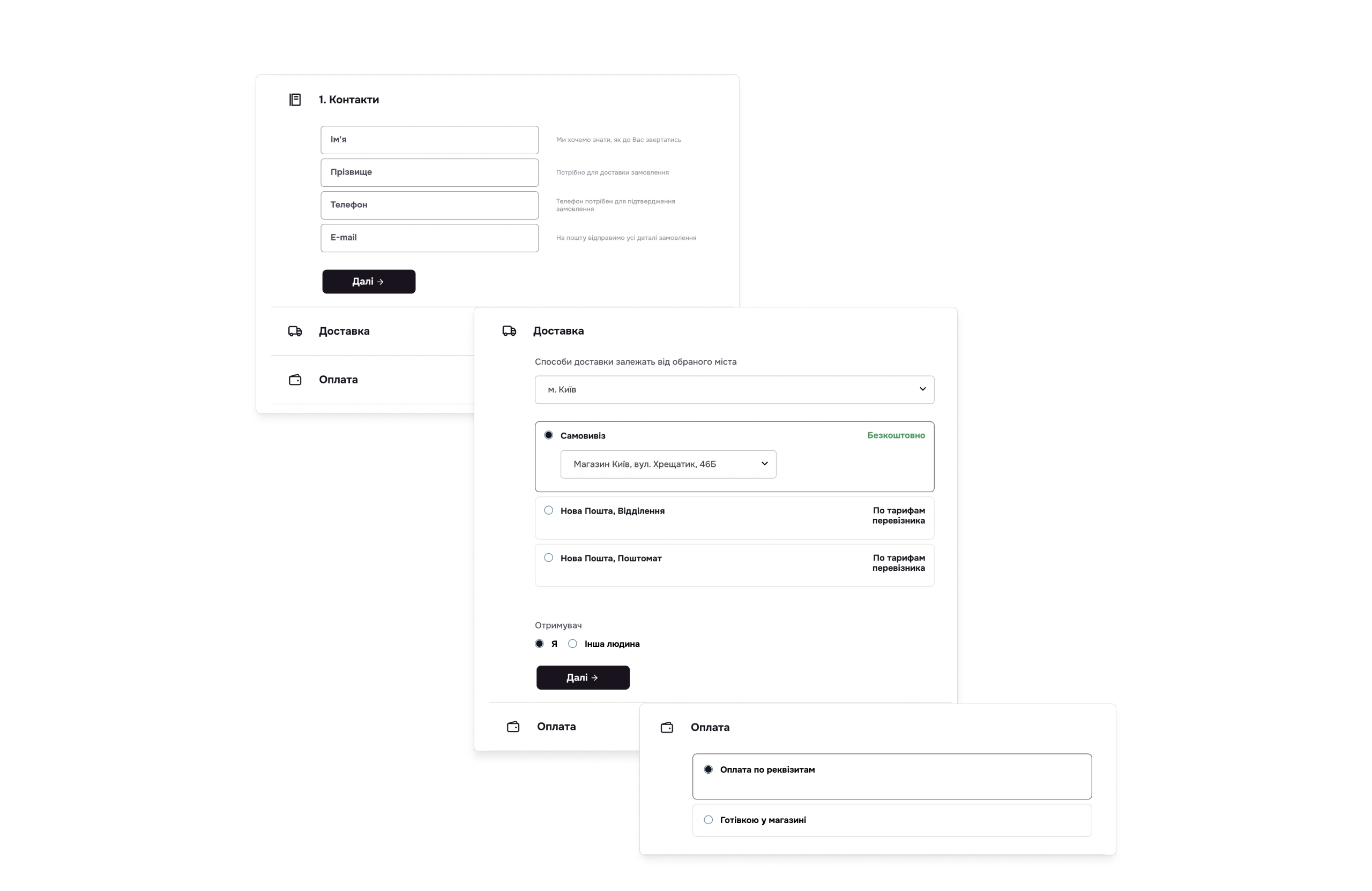
✅ Simplified checkout form
- How it works: A minimal number of fields, requesting only essential informatio
- Why it matters: Reduces drop-offs caused by a complicated process.
Impact on conversion: Cuts visual clutter, keeping the user focused on what’s important.
9. Error Recovery
Тhis principle implies that the system should clearly communicate errors, explain their cause, and provide specific solutions or instructions.
E-commerce use cases:
✅ Password error hints
- How it works: After a failed login attempt: “Incorrect password. Forgot your password? [Reset] or try again.” (Instead of just “Authorization error.”)
- Why it matters: Provides a clear solution path for the user.
✅ Clear Input Error Messages
- How it works: The “Phone number” field is highlighted in red with the message: “Enter a valid number in the format +380 XX XXX XX XX.” (Instead of just “Invalid format.”)
- Why it matters: Users know exactly how to fix the mistake.
Conclusion: Effective error handling isn’t just a technical requirement—it’s a powerful tool for customer retention and boosting conversion. Top e-commerce sites invest in clear, helpful error messages that actively assist users rather than merely stating problems.
10. Help and Documentation
Effective error handling isn’t just a technical requirement—it’s a powerful tool for customer retention and boosting conversion. Top e-commerce sites invest in clear, helpful error messages that actively assist users rather than merely stating problems.
E-commerce use cases:
✅ FAQ
- How it works: A dedicated “Information” section with categories like “Payment,” “Delivery,” and “Returns.”
- Why it matters: Users find answers on their own without waiting for customer support.
✅ Contextual tooltips in the interface
- How it works: “?” icons next to input fields, terms, or interface elements.
- Why it matters: Users get explanations without having to search for information elsewhere.
Benefits for the business: Lowers support team workload as customers self-serve answers; boosts trust—buyers appreciate the store’s attentiveness; reduces abandoned orders caused by unclear processes.
Conclusion: 10 Nielsen’s heuristics in practice
Applying Jakob Nielsen’s 10 usability heuristics in e-commerce directly impacts conversion growth and reduces cart abandonment rates. For example, error prevention minimizes incomplete orders, while standardizing elements speeds up navigation. Together, these improvements can boost conversions by 20-30%, reduce support workload, and increase customer loyalty. By integrating these principles, you make your store not just user-friendly—but highly effective at driving sales.
The article was prepared based on article 10 Usability Heuristics for User Interface Design on the NNGroup website.