Content marketing
Content that converts clicks into customers
Why do you need content marketing?
Content marketing plays an important role in attracting audience attention to a brand by creating valuable and interesting content.
Video, 360 photos, AR and much more are the result of the development of digital and requests from spoiled customers, as buying products out of photos of different angles and descriptions is no longer enough for them. And this is true. Market players are resorting to various tricks so that customers stay on a product page as long as possible, discover a product anew and “fall in love”.
But what if you squeeze all this into one site? “Here, please, look, we are very modern and fashionable, we follow trends and know how to do different things”. With all of that it is so easy to lose sight of the main task that the site should complete – to sell. The site is to be unique, simple and eye-pleasing, not to show the capabilities of your developers and the imagination of your designers.

This way you can get unique photos with a properly arranged atmosphere.
The difference with a photoshoot is that it gives you control over every aspect of images, from composition to colours. Good quality photos can attract the attention of potential buyers and increase conversions.

Creating content for Chila.ua
We conducted a photoshoot of the entire range of the Chila online store. Considering that the company is the manufacturer of these products, this approach allowed us to preserve the unique style and detail in every shot.

Each photoshoot involved careful planning and selection of elements to highlight. Great attention was paid to details and textures. It was important for us to showcase the quality and visual appeal of each product.
The result of our work was a collection of stunning photographs that not only reflect the quality of the products but also attract the attention of customers.


Content creation for soundmag.ua
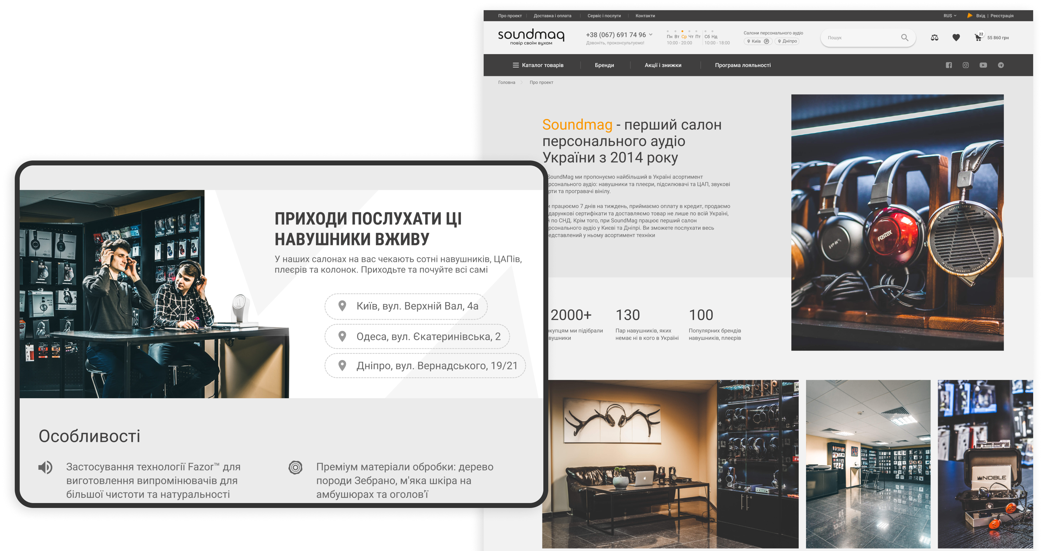
To best convey the mood of Soundmag, we conducted a photo shoot of their music listening studio and products to use this content to style the company’s website.

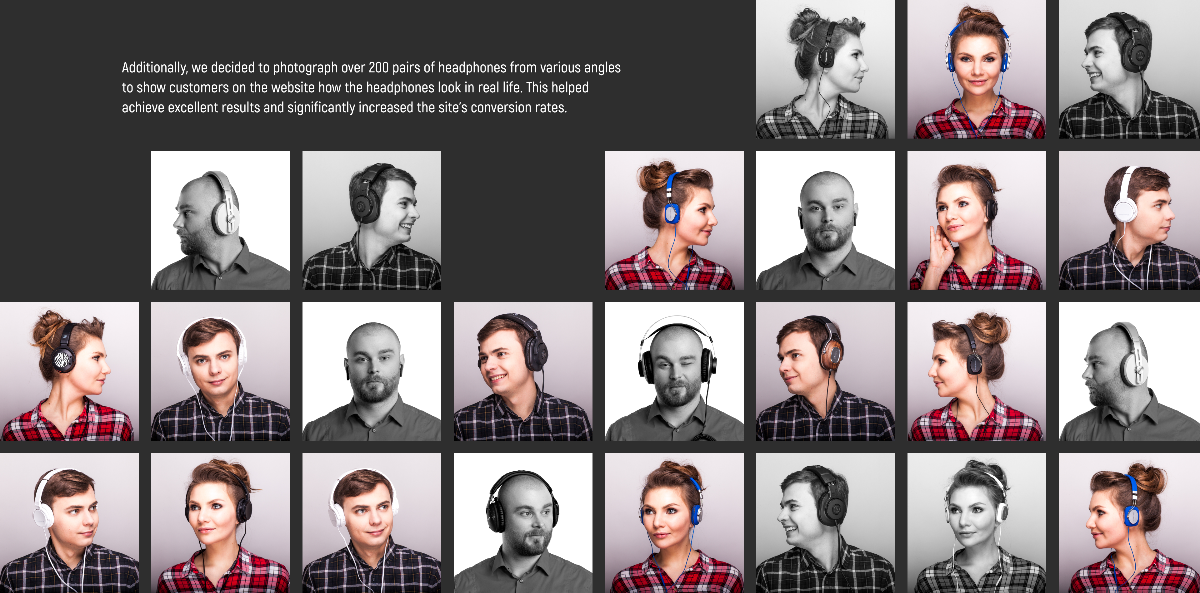
Using created content
The photos taken in the music listening studio perfectly complemented the design and conveyed the cozy atmosphere of the Soundmag store.

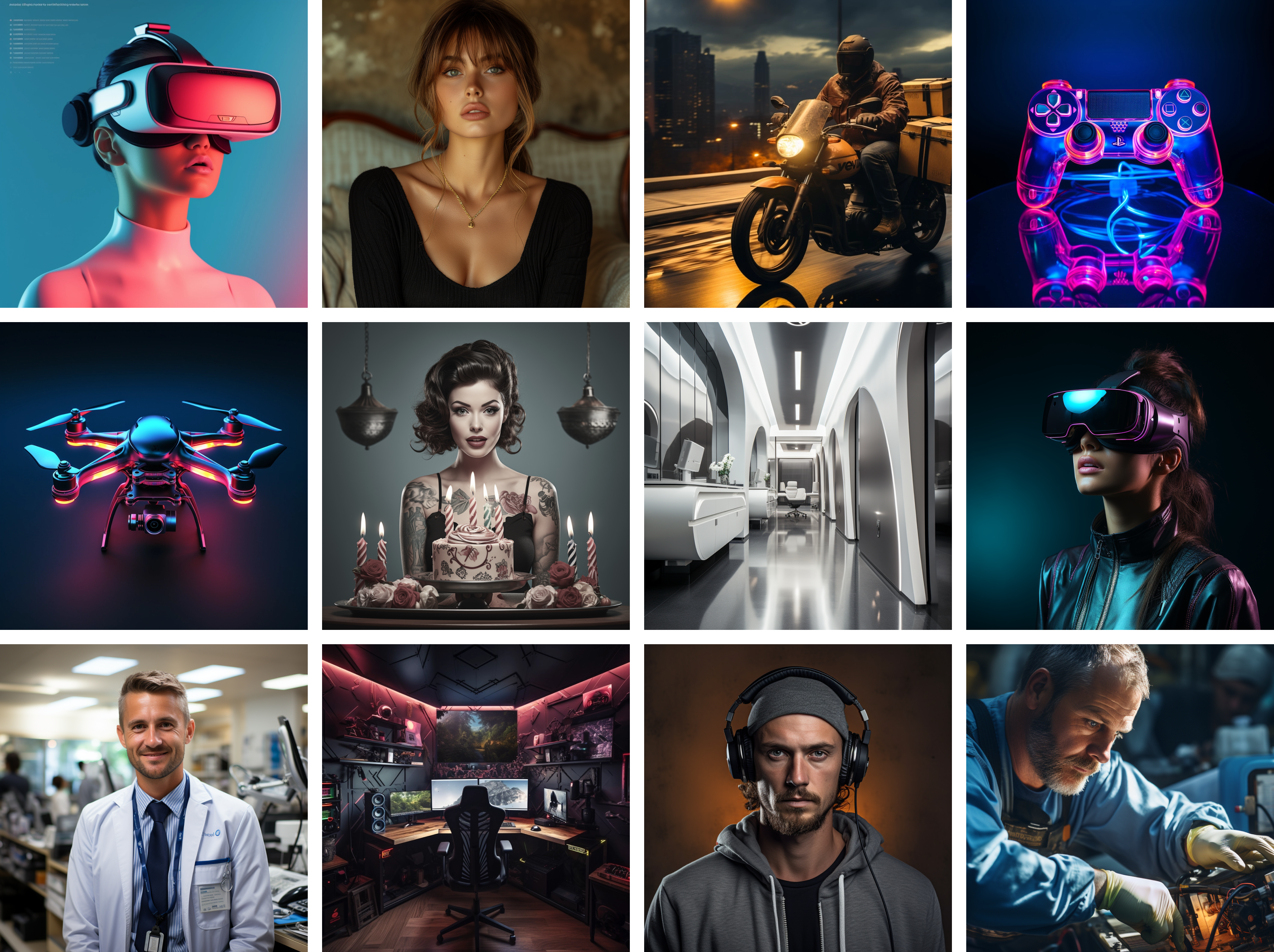
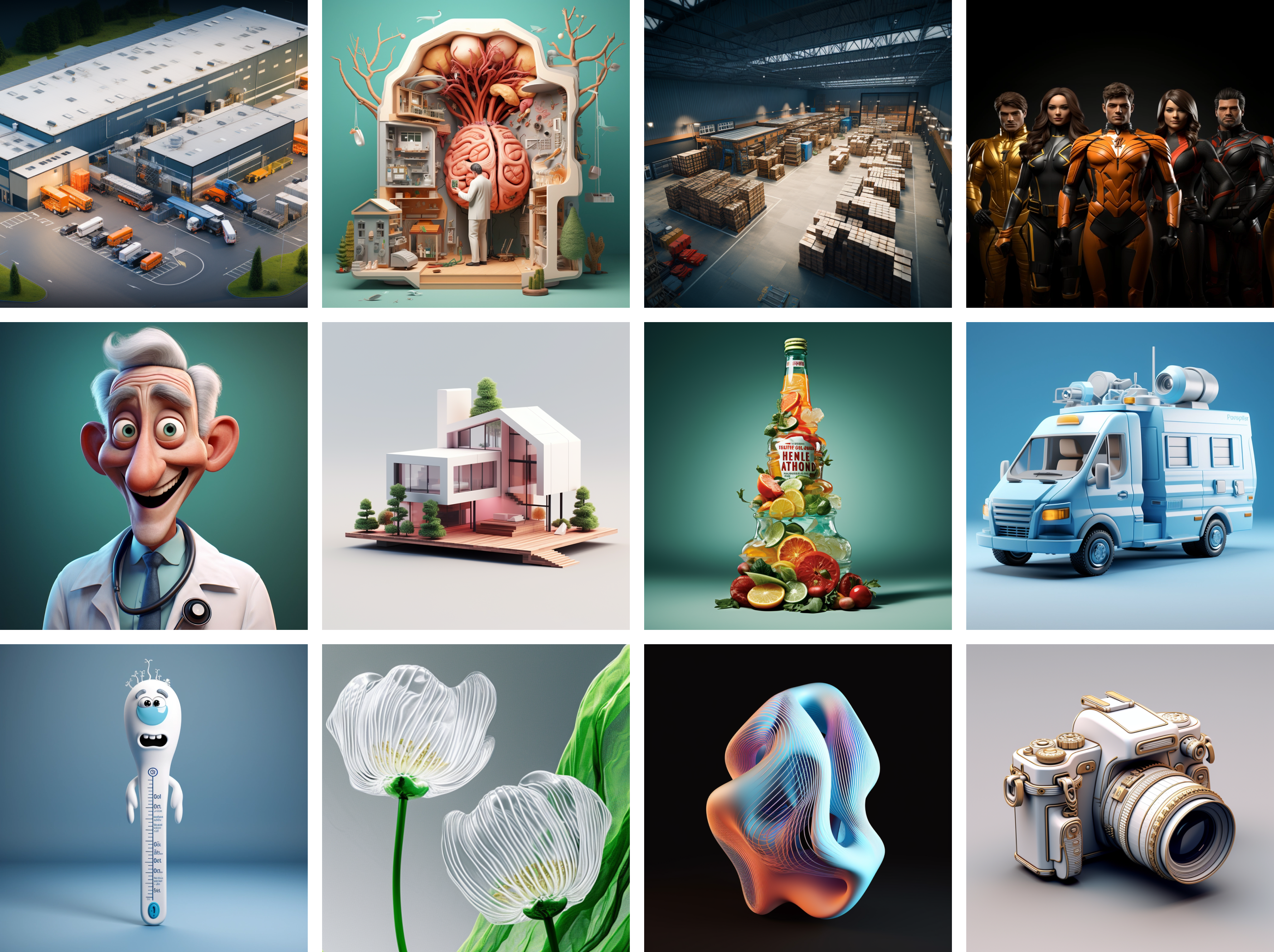
The use of artificial intelligence allows you to automate the generation of unique graphic elements, personalize compositions, and effectively design pages, raising the quality and aesthetic value of web design to a new level.
Artificial intelligence can be used to create a variety of visual elements on a website:

photographs
AI-generated photographs allow to get unique images that are not limited to those ones available on stock platforms.
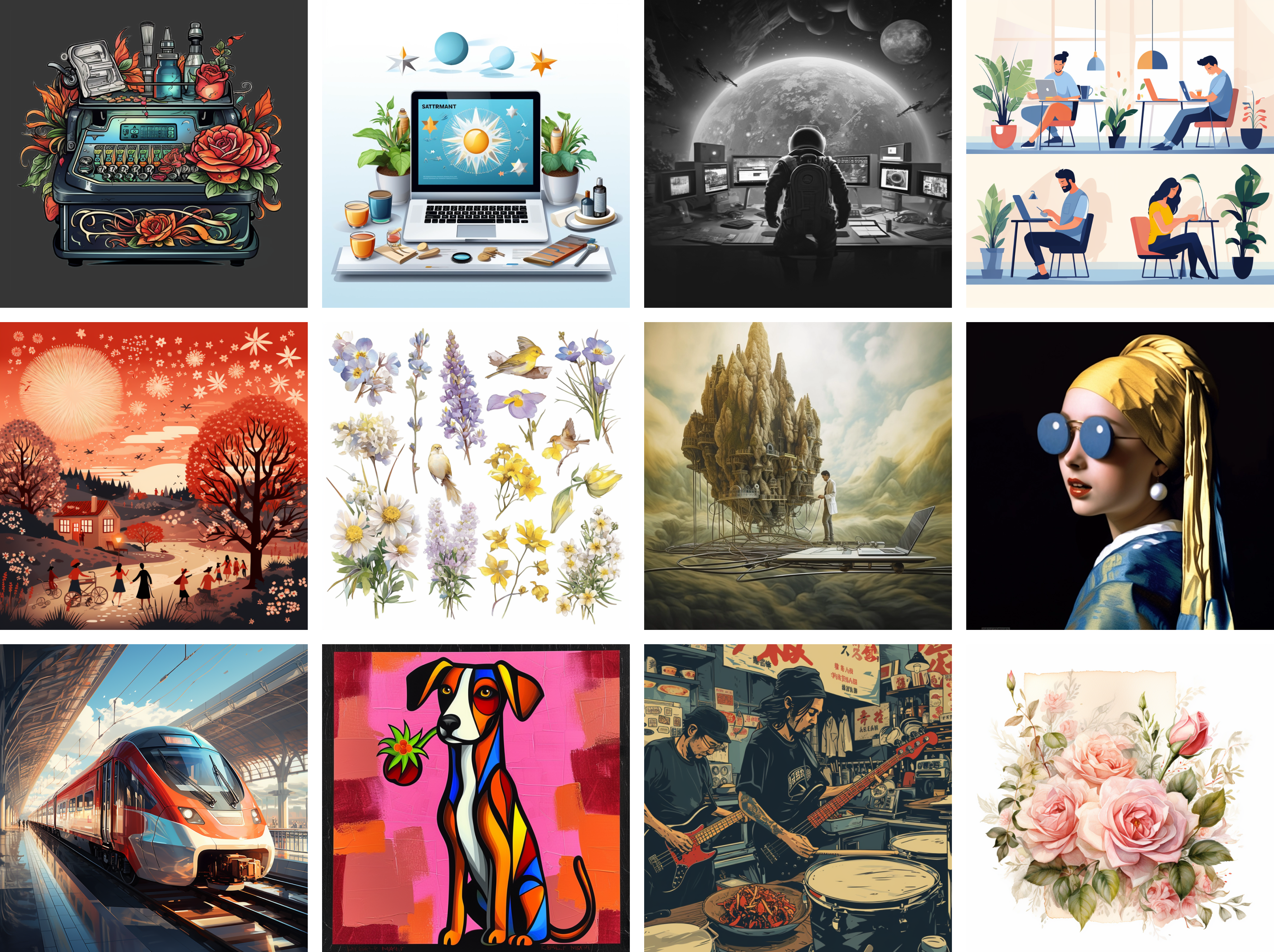
Illustrations and Graphics
AI algorithms enable the rapid and efficient creation of illustrations and graphic elements tailored to specific requirements. This saves time and costs while ensuring high quality and aesthetic value of visual content.
3D images
The use of AI to create 3D images and models allows for the rapid and efficient generation of three-dimensional content without the need for specialized graphic skills.
Using stock photos allows you to quickly and efficiently find suitable images for your website without having to organize your photo shoots.
However, using stock photos has its drawbacks and risks, one of which is the lack of originality of the content, which can reduce the uniqueness of the website. Different businesses can use the same content, which leads to a loss of brand recognition.

Stock platforms provide access to a wide range of high-quality photographs that can be used to create engaging and professional content.

Our cases
The application has been successfully completed! We will contact you shortly. In the meantime, check your mail, we sent you something